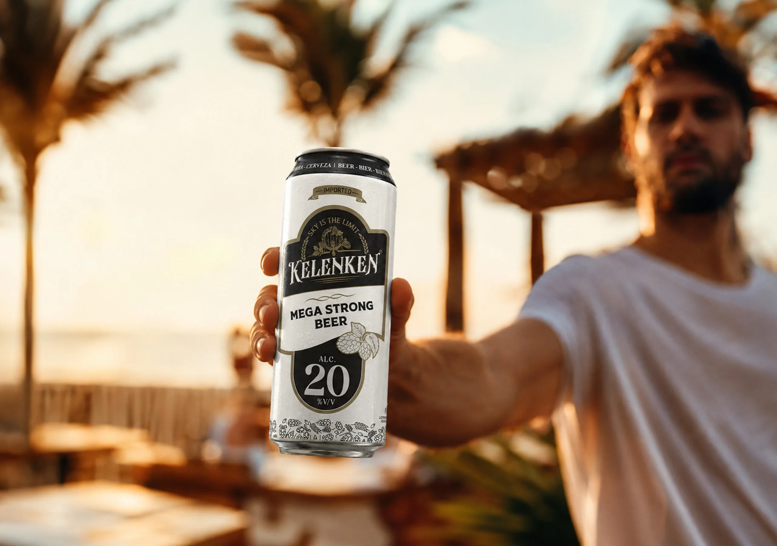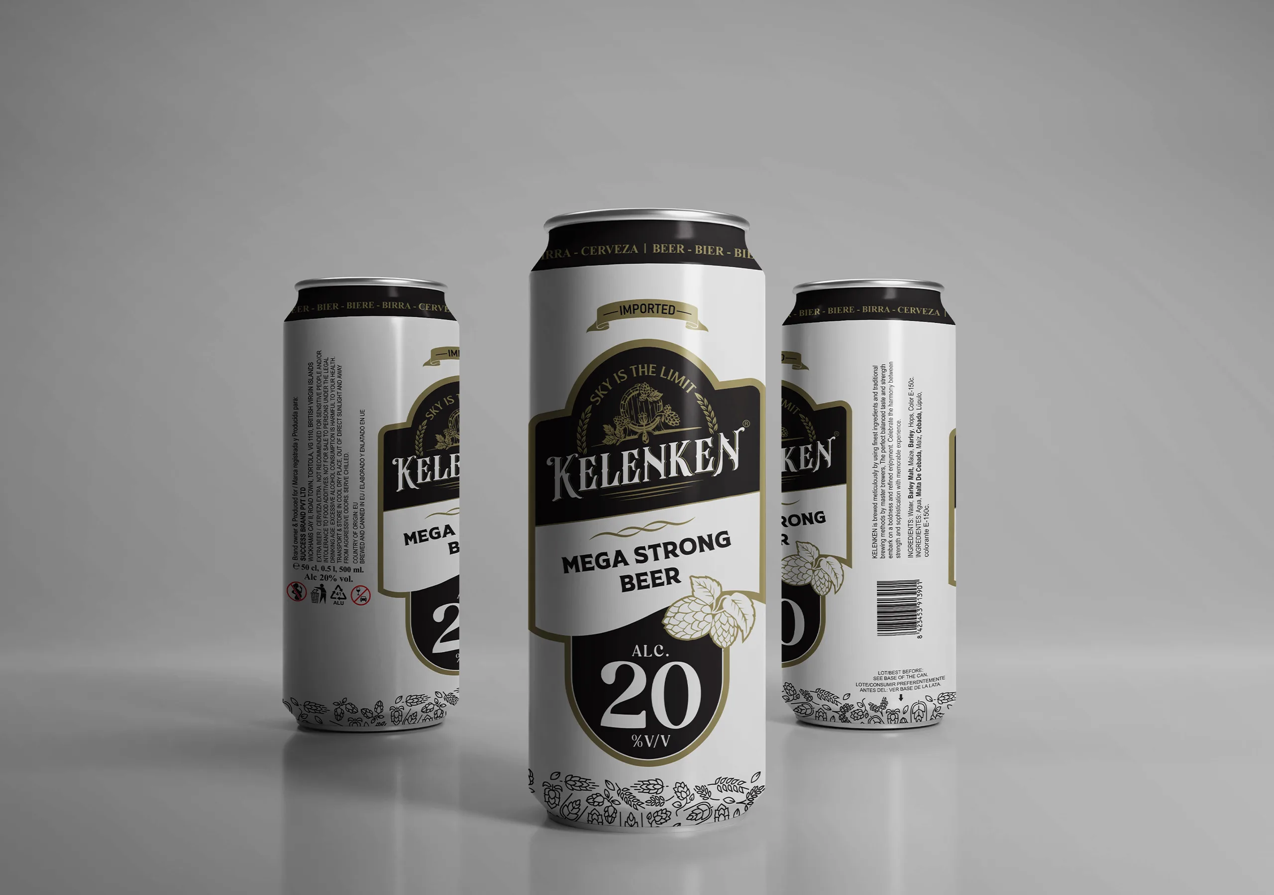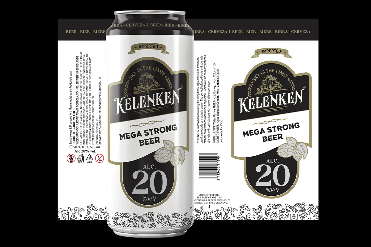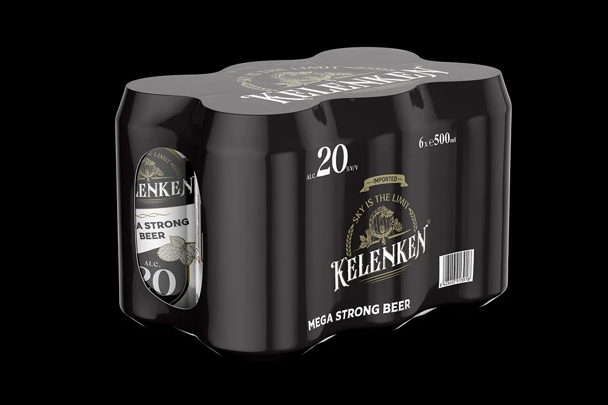
Kelenken Beer Packaging Design

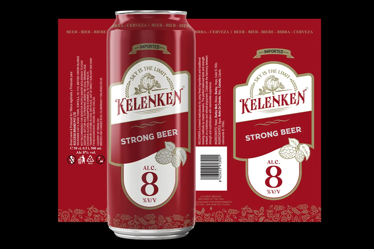
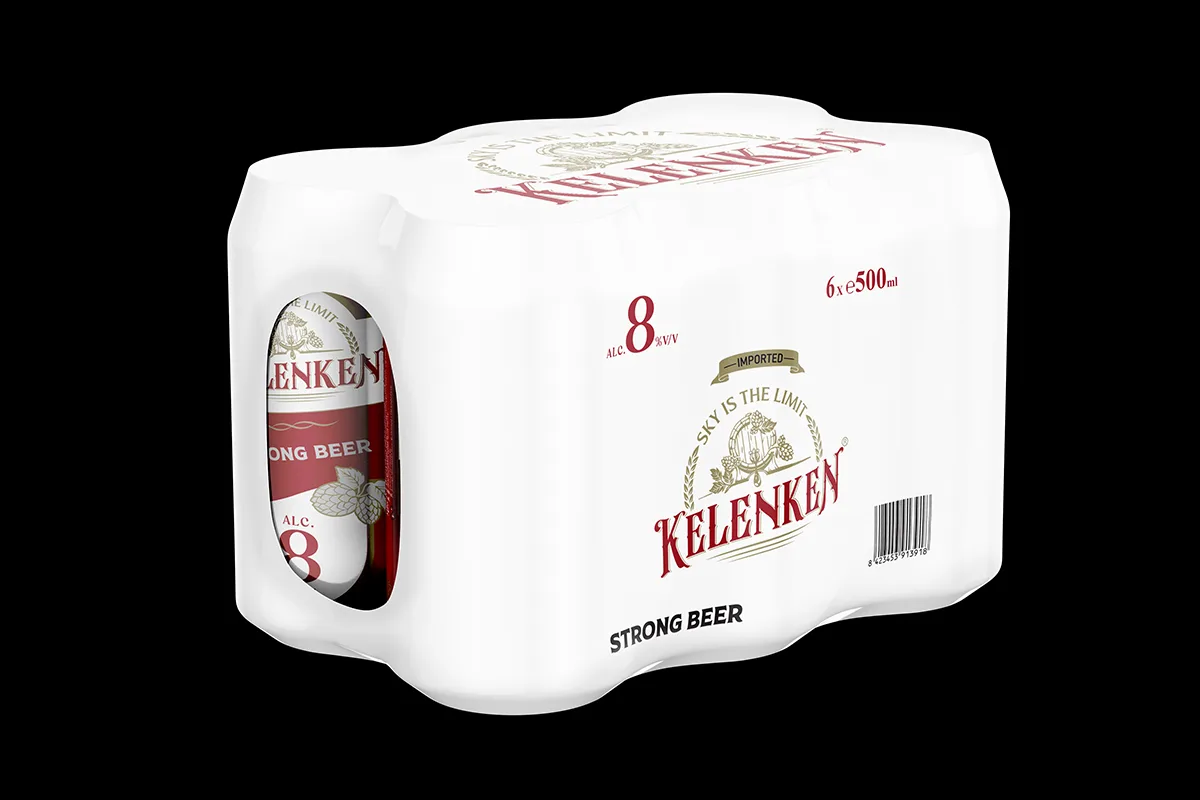
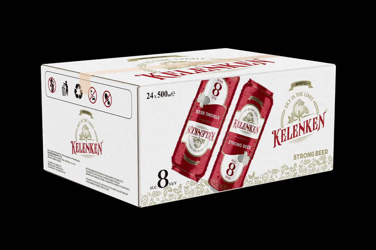
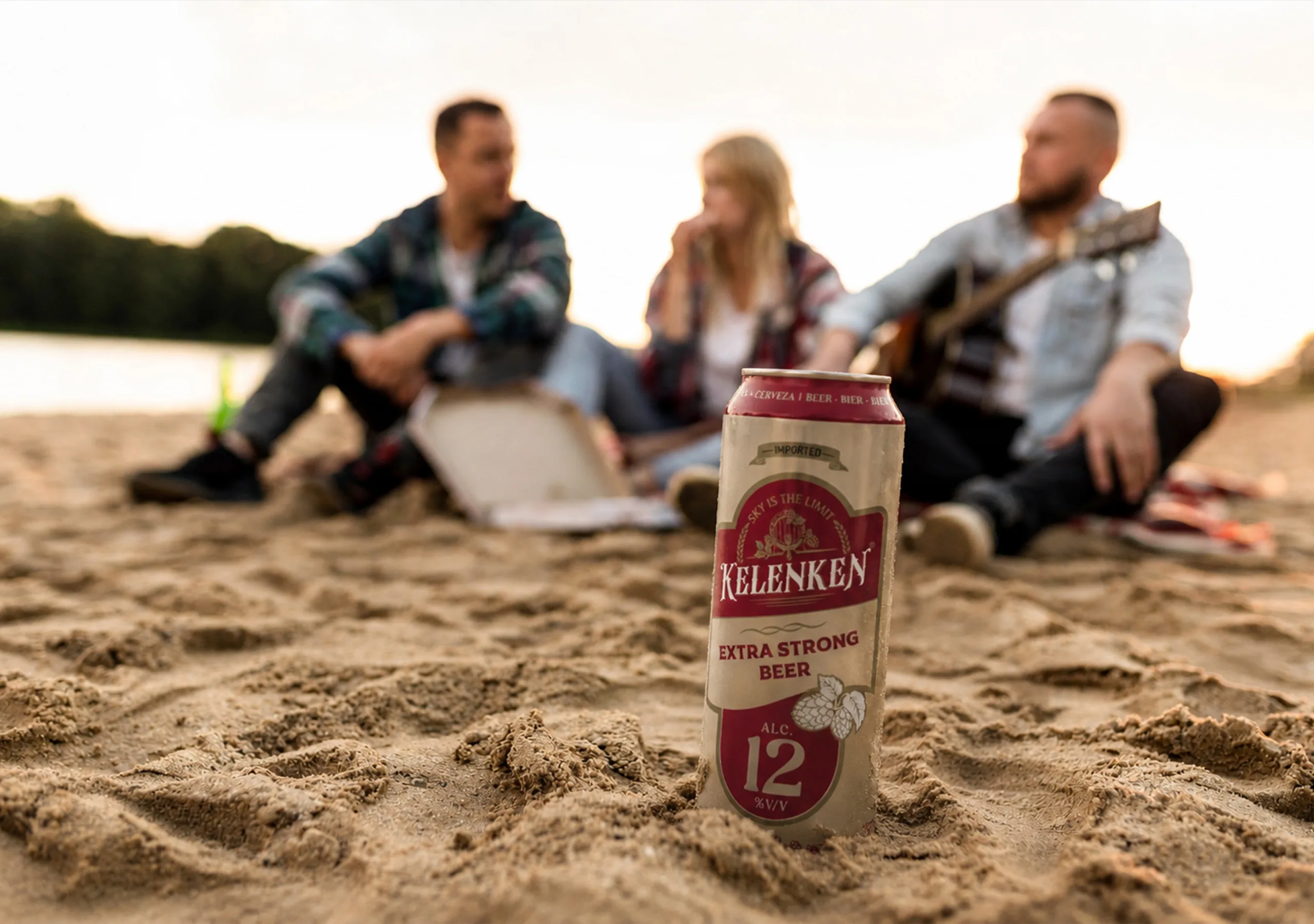
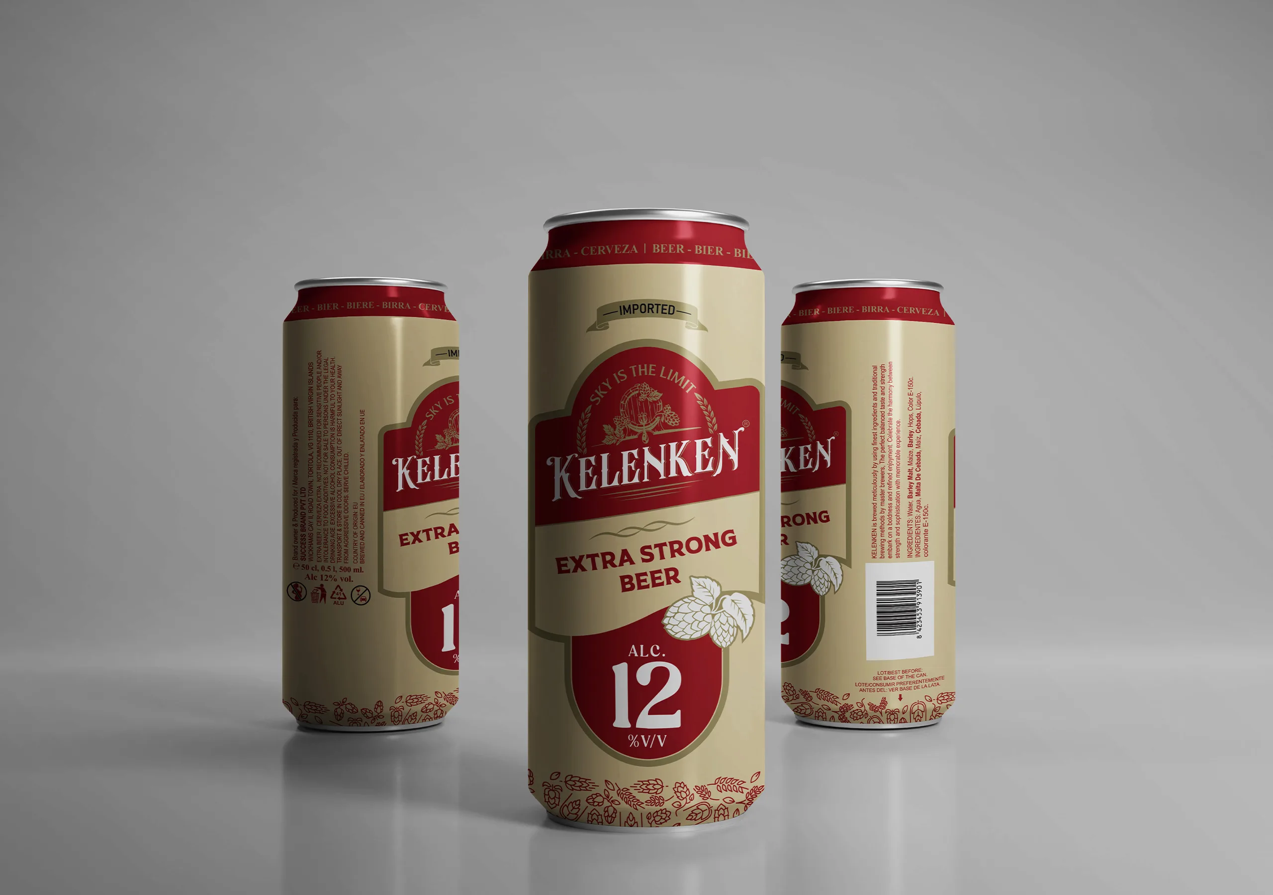
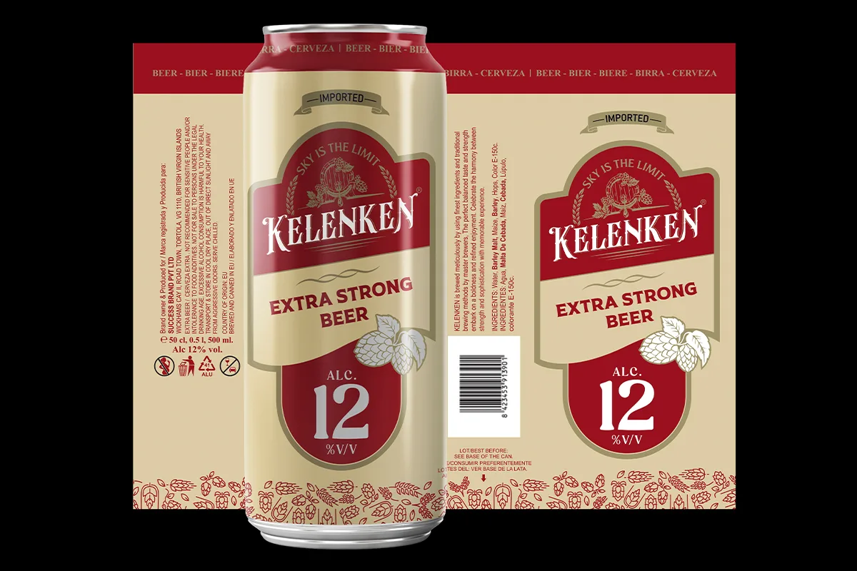
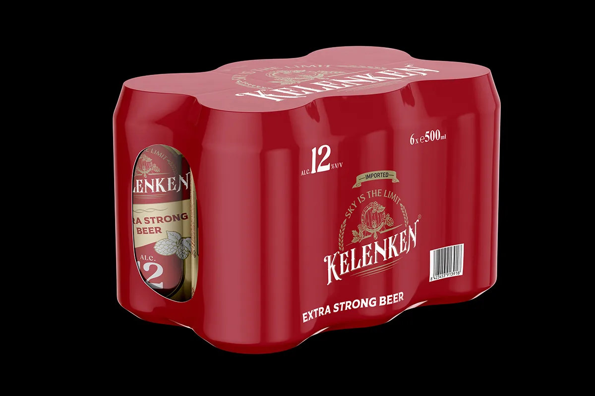
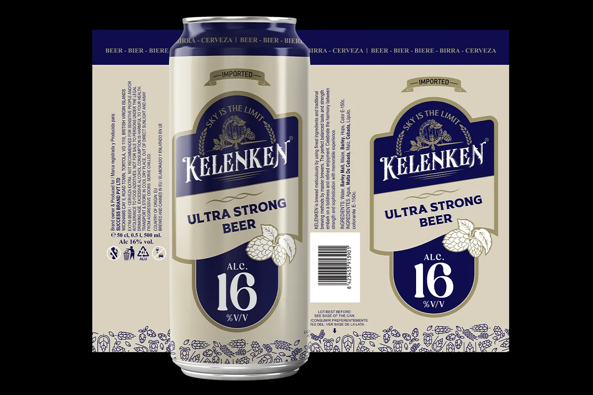
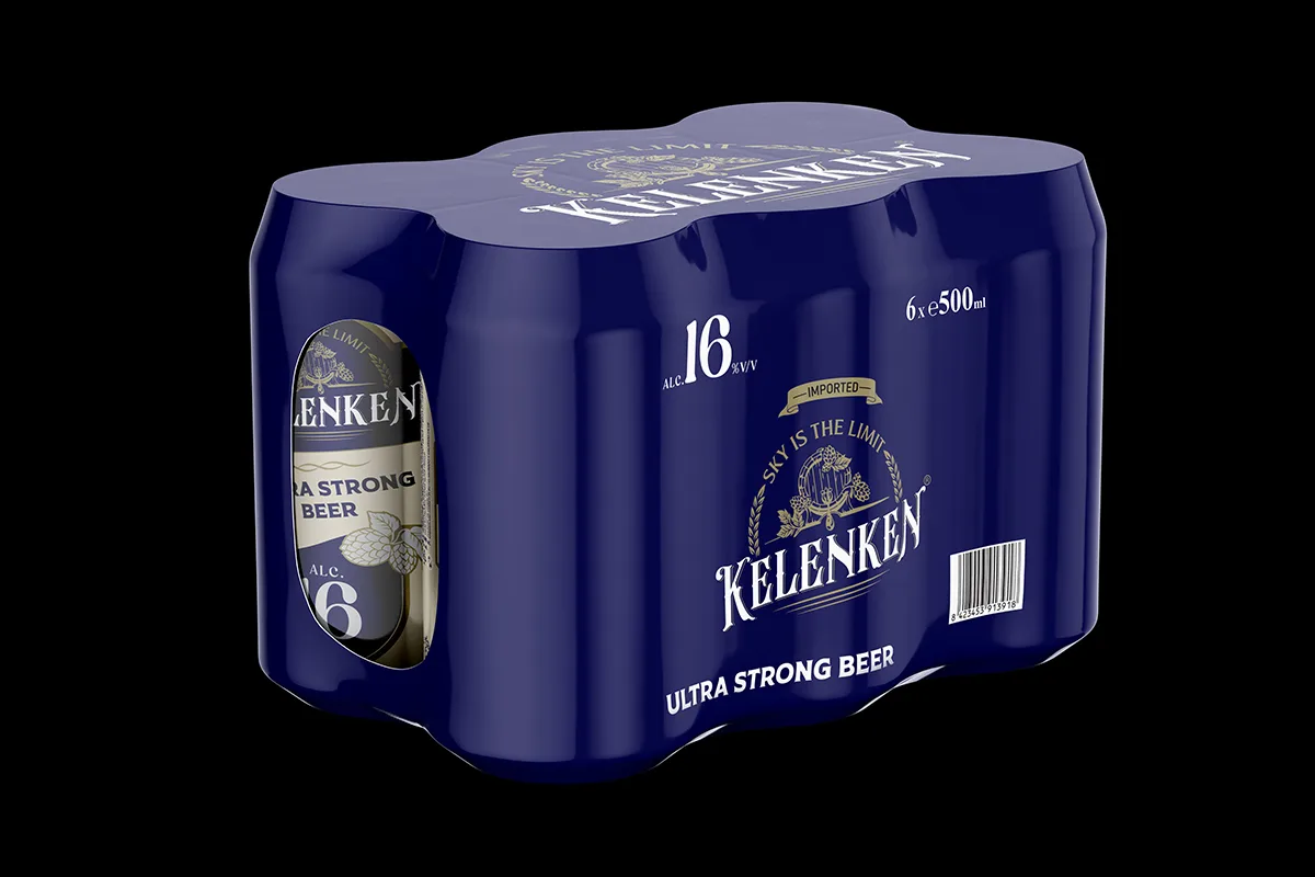
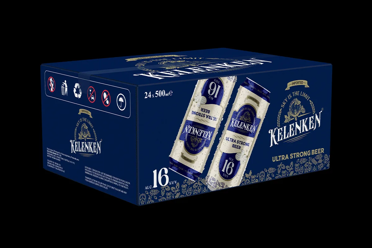
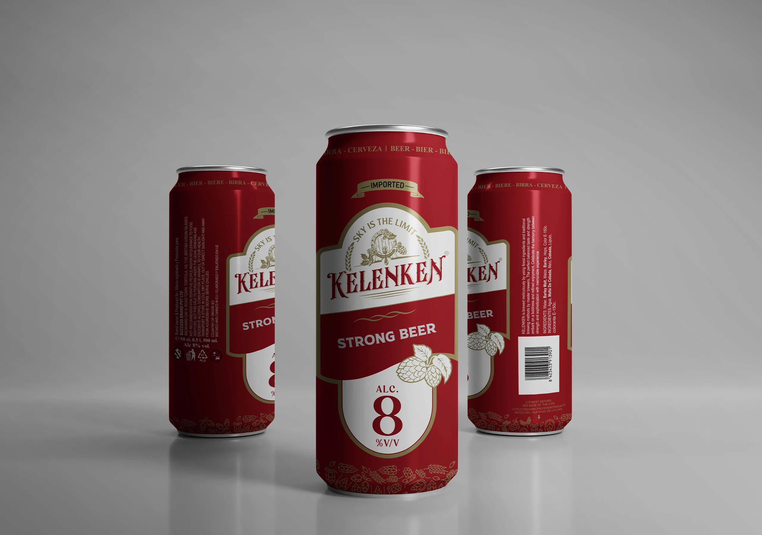
Developed a complete beer packaging system for Kelenken, including logo creation, four can variants, shrink sleeve packs, tray packaging, and master carton designs. Created to strengthen shelf presence, improve brand recognition, and support retail distribution, the project combined strategic packaging development with production-ready execution for the Malaysian market, with brewery manufacturing coordinated in Spain.

The Kelenken identity began as a hand-drawn concept inspired by traditional brewing heritage and the adventurous spirit behind the brand. Starting with pencil sketches, the design explored classic beer branding elements that communicate authenticity, craftsmanship, and premium product quality.

The logo combines a vintage-inspired wordmark with symbolic brewing cues, including barley, hops, and a wooden barrel, reflecting the core ingredients and traditions associated with beer making. The tagline "Sky Is The Limit" reinforces the brand's ambitious personality, while the final identity was refined to create a strong visual presence across packaging, retail displays, and promotional materials.

From the initial sketch to the finished artwork, every detail was carefully developed to create a distinctive beer brand that balances heritage, character, and strong shelf appeal.

Four Strengths. One Powerful Brand.

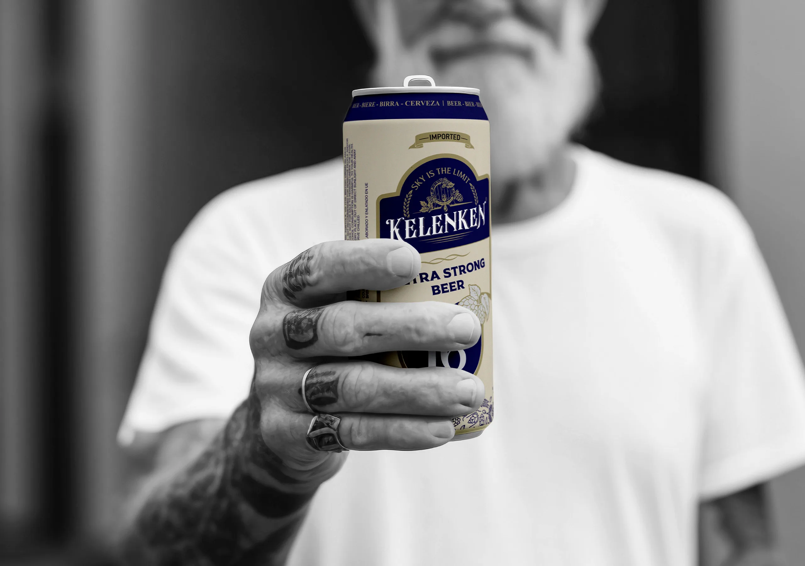
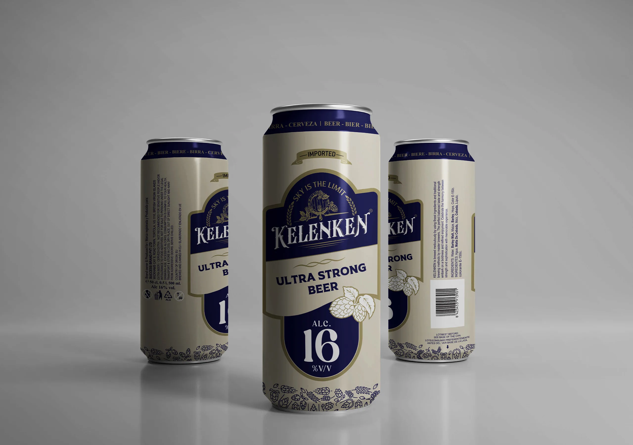
The Kelenken product range was developed to serve different consumer preferences while maintaining a unified brand identity across the complete portfolio. Each variant was carefully designed with its own strength classification, visual hierarchy, and packaging distinction, ensuring clear product recognition without compromising overall brand consistency.

Product Variants:
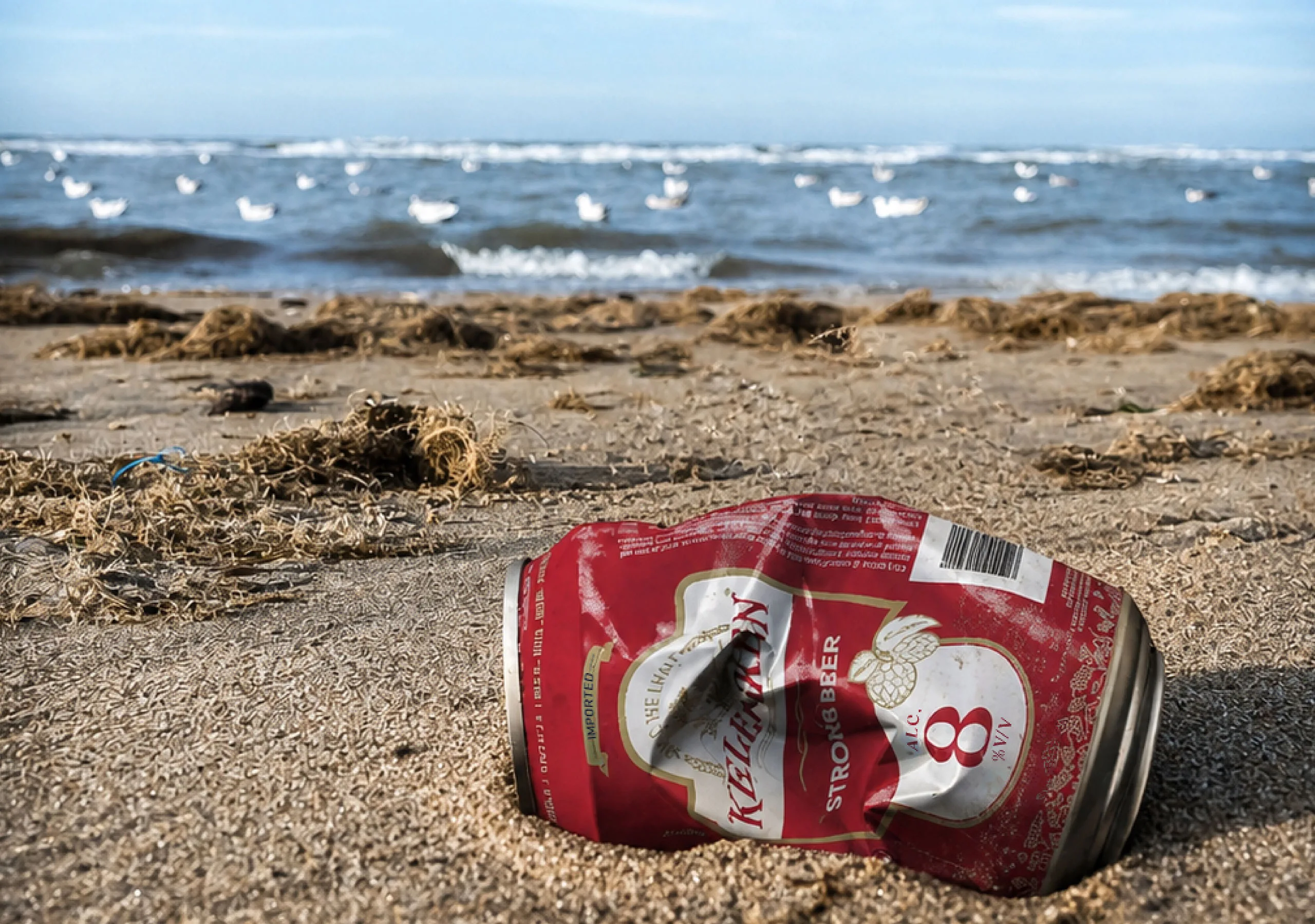
• 8% Strong Beer
• 12% Extra Strong Beer
• 16% Ultra Strong Beer
• 20% Mega Strong Beer

Together, these variants create a scalable product family designed to strengthen shelf visibility, support retail differentiation, and build stronger brand recognition across the beer category.

Building a Complete Retail Packaging Ecosystem

Kelenken was developed as a complete beer branding and packaging system designed to create a strong and memorable retail presence across multiple consumer touchpoints. The project encompassed four distinct beer variants supported by a unified packaging architecture that delivers both brand consistency and clear product differentiation, helping consumers easily identify each variant while strengthening overall brand recognition.

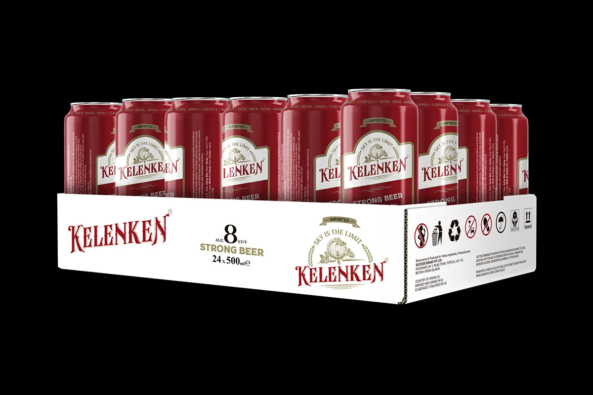
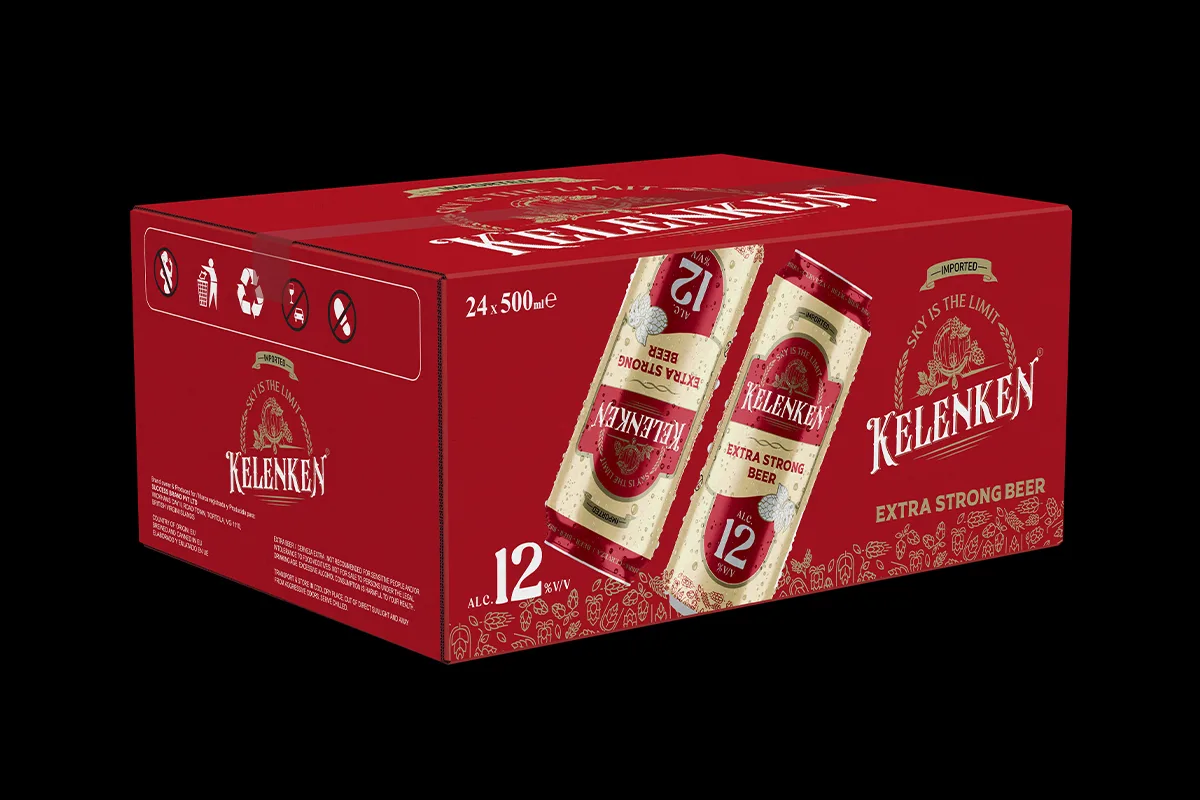
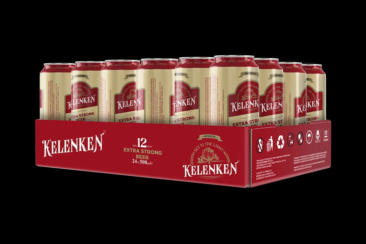
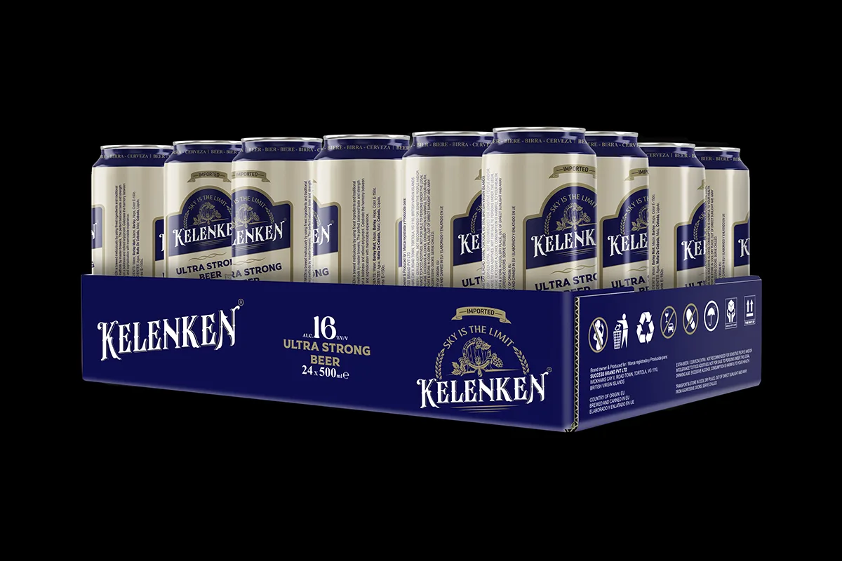
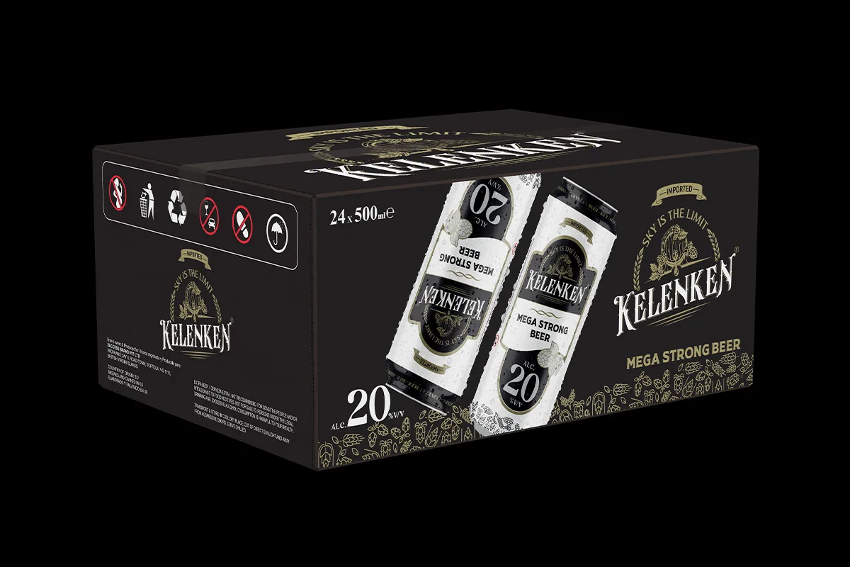
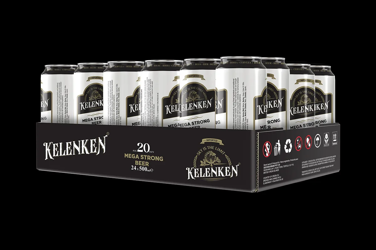
Project Deliverables: • Master Can Design • 6-Can Shrink Sleeve Pack Design • 24-Can Tray Pack Design • 24-Can Master Carton Box Design

Every packaging component was strategically developed to enhance shelf impact, improve brand visibility, and ensure a seamless brand experience from individual cans to large-scale retail distribution packaging.
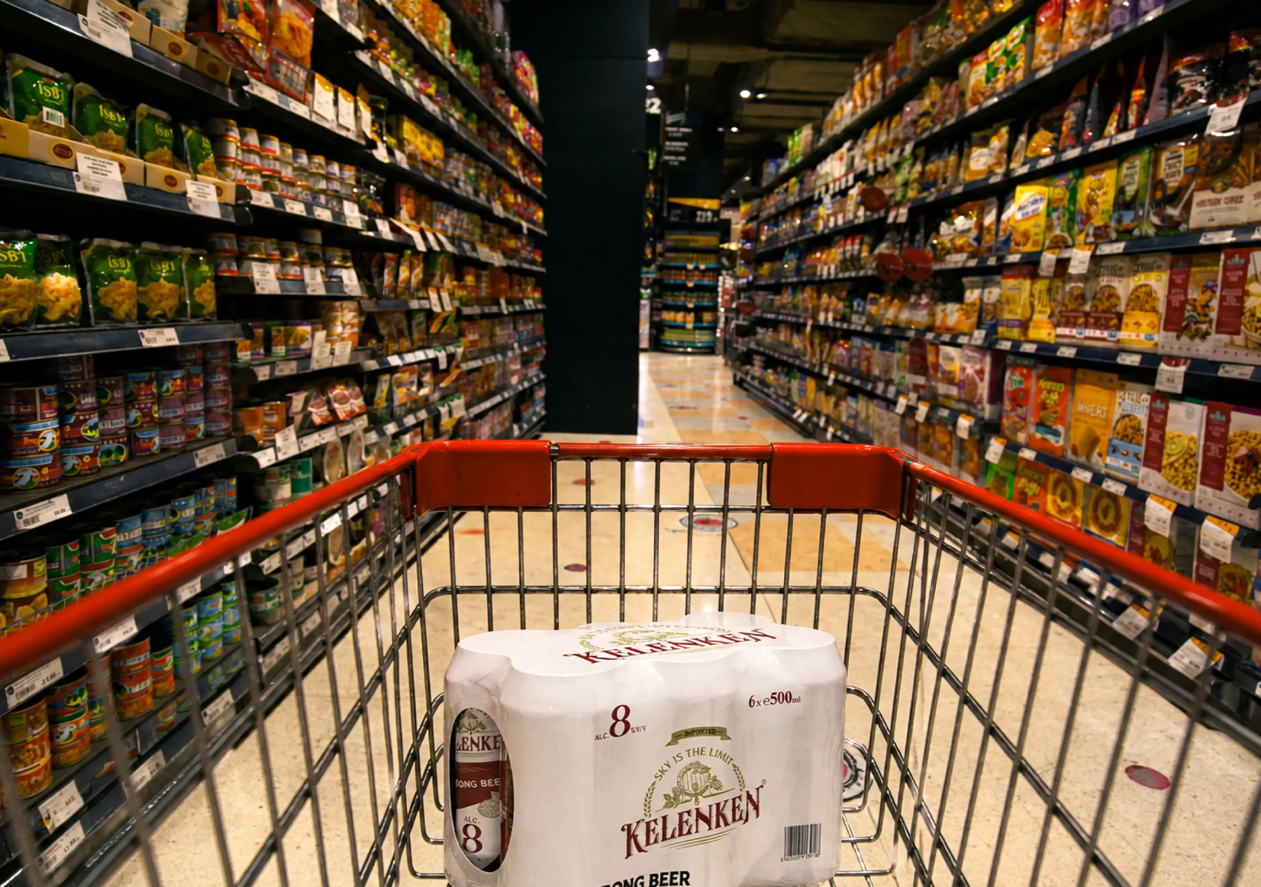
Prepared for Commercial Beer Production

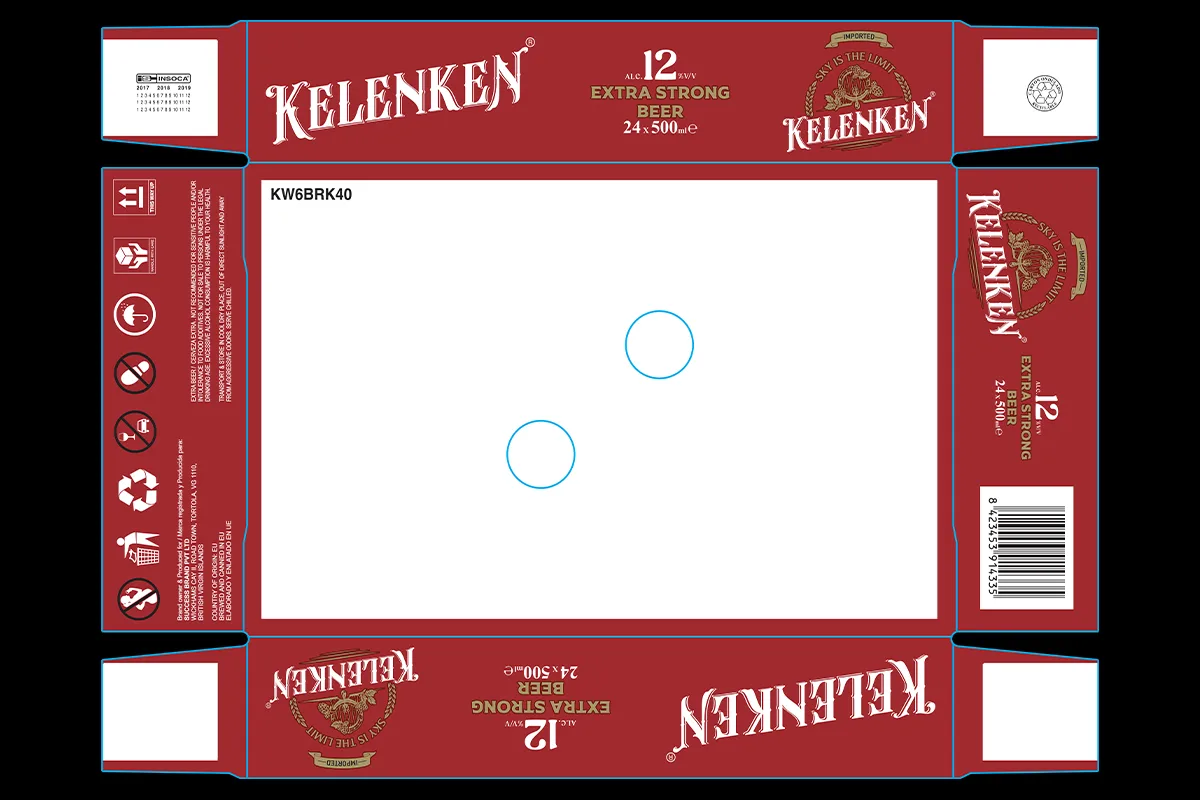
For Kelenken, production-ready CTP artwork was developed for the 24-can tray packaging system, ensuring accuracy, consistency, and smooth manufacturing execution. The final print files were prepared to meet commercial production requirements and supplied for manufacturing coordination in Spain, helping transform the approved packaging design into a retail-ready product.

Production Deliverables:
• Production-Ready CTP Artwork
• 24-Can Tray Packaging Print Files
• Manufacturing Coordination Support
• Commercial Production Preparation

Building a Complete Beer Packaging System for Retail Success

For Kelenken, Get Noticed developed a comprehensive packaging architecture designed to establish a strong brand identity across multiple beer variants while maintaining a consistent retail presence. From logo creation and can design to secondary packaging and production artwork, the project was created to improve shelf impact, strengthen consumer recognition, and support market growth.

Project Deliverables:
Logo Design · Master Can Design · 4 Beer Variant Designs · 6-Can Shrink Sleeve Pack Design · 24-Can Tray Pack Design · 24-Can Master Carton Box Design · Production-Ready Print Artwork

Brand Objectives:
Strengthen Shelf Visibility · Improve Brand Recognition · Create Clear Variant Differentiation · Enhance Consumer Appeal · Support Retail Distribution Growth

Get Noticed developed the complete Kelenken brand identity and packaging system, including logo design, four beer can variants, shrink sleeve packs, tray packaging, master carton designs, and production-ready artwork.
A unified packaging architecture was created to ensure all four variants shared a common brand identity while using clear visual differentiation to communicate their individual product strengths.
Effective beer packaging helps products stand out on crowded retail shelves, strengthens brand recognition, communicates product positioning, and influences consumer purchase decisions.
Yes. The project included production-ready CTP artwork and manufacturing files prepared to support commercial printing and large-scale packaging production requirements.
Yes. Get Noticed specializes in creating complete branding and packaging solutions for beverage, FMCG, food, and consumer product brands serving regional and international markets.
The project covered logo creation, four beer can designs, 6-can shrink sleeve packs, 24-can tray packaging, master carton development, production coordination support, and retail-ready packaging execution.